Sloane Harper
Sloane Harper came to us with an established business and a bold vision for her next chapter. As a leadership coach for high-performing entrepreneurs, she had already proven her expertise, but her brand wasn’t keeping pace with the depth of her work.
The challenge was clear: create a brand that feels modern and premium, while still grounded, human, and relatable. It needed to showcase Sloane’s sharp insights and ability to name the unseen, without slipping into jargon or fluff. Every element had to balance her authority with her wit, her boldness with her compassion.
Together, we dialed in her brand voice and messaging, crafted a distinct visual identity, and designed creative assets that will scale alongside her signature framework.
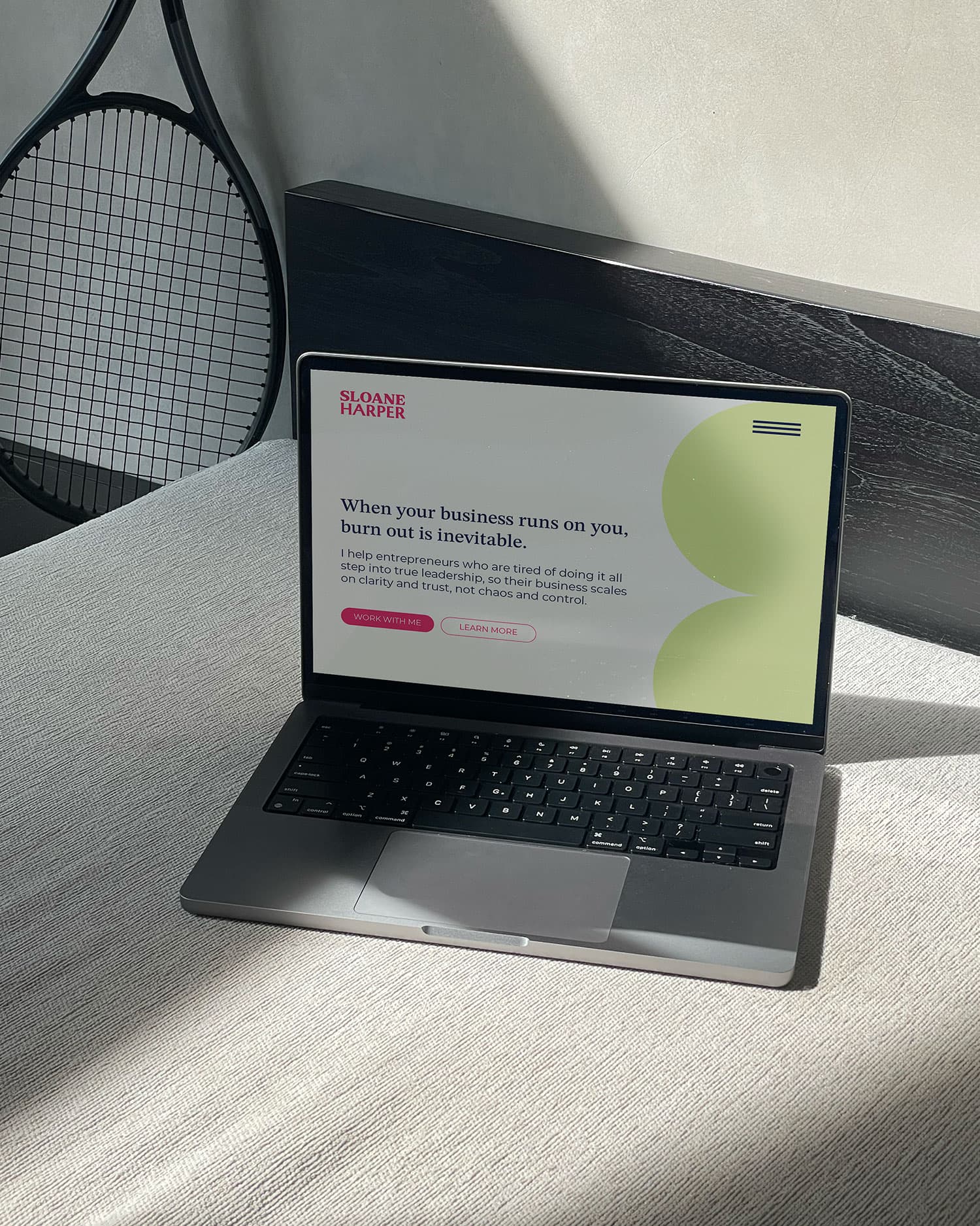
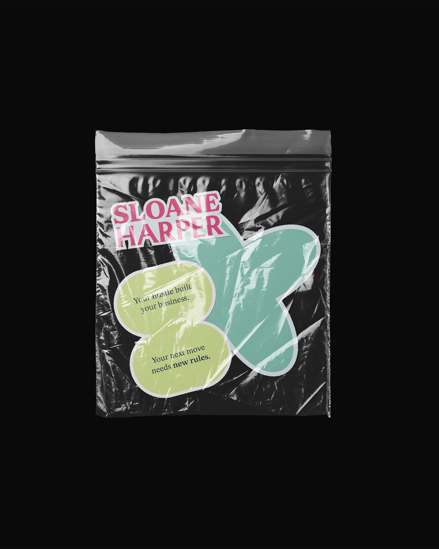
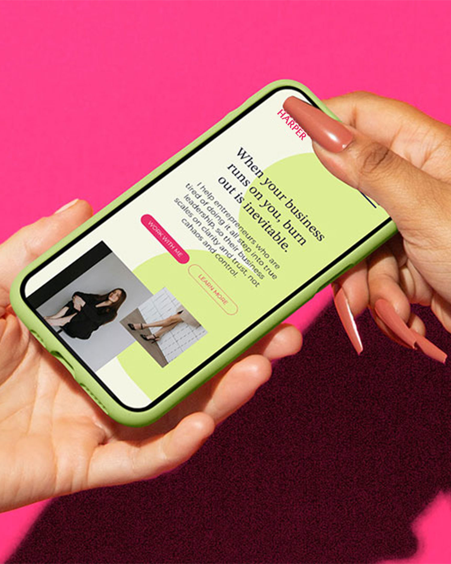
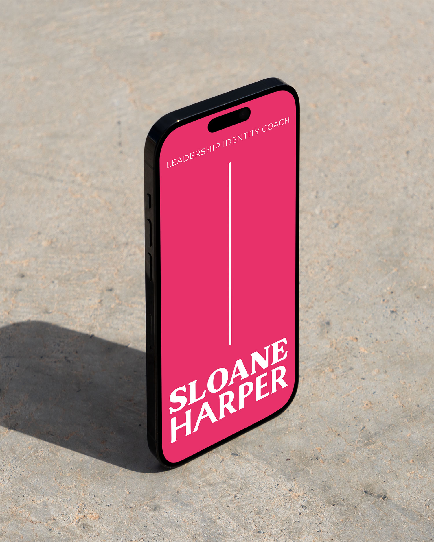
The result is a brand that’s smart, grounded, and direct, with just the right touch of wit. The bold yet earthy color palette mirrors Sloane’s mix of executive presence and human relatability, while the vibrant pink brings her sharpness and playfulness to life. The three geometric shapes tie directly to her signature three-step framework, ensuring immediate recognition and consistency as she grows.
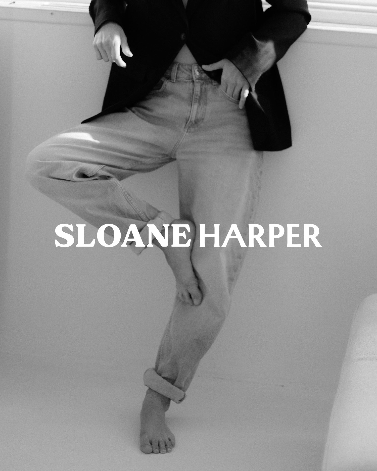
Her photography direction blends styled, editorial shots with collaborative, community-centered imagery, a reflection of her belief that leadership is not built in isolation but alongside others. And her messaging is sharper than ever. What once felt vague now clearly articulates her unique ability to surface subconscious blocks and translate them into meaningful action.
Every element of this rebrand was designed to not just look beautiful, but to anchor Sloane as a leader in her field: confident, approachable, and impossible to overlook.
OUR SOLUTION
Brand STRATEGY
BRAND IDENTITY
Web design